Next Level Sizing: Why the upgrade is worthwhile
After a year of development, Version 3 of Smartfit's e-commerce sizing is here – time to take a look at the exciting new features!

Marie Schmidt
With the launch of the new software version, a lot has changed in Smartfit's e-commerce sizing. What can customers expect from the new version? In this article, we introduce you to some of the new features and show what we've learned from user feedback so far.
Main reason for the development of the new software version
The primary motivation for developing the new version (V3) was the need to overcome functional and technical limitations of the previous version (V2). V2 was originally designed exclusively for bicycle sizing—expanding it to include other sports products such as skis, backpacks, helmets, or protectors was technically impossible. While the ski section was subsequently added, it was only indirectly, which highlighted the structural limitations of V2. The vision of creating a scalable system potentially suitable for up to 30 different sports (e.g., in the context of integration with large, all-rounder online shops) could not be realized with the existing architecture.
Technical and conceptual developments
In addition to extensibility, technological advances also played a key role. V3 was rebuilt with modern technology to incorporate the experiences gained from four to five years of V2. These include:
- a mobile-first approach, as usage is increasingly via smartphones and tablets
- improved usability based on in-depth insights from extensive user testing
- an optimized and more modular architecture for easier expansion and maintenance
New requirements from the product area
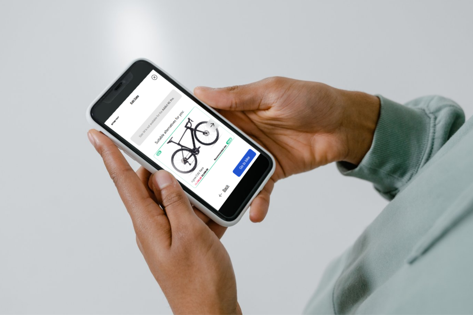
Even within the original bicycle segment, new requirements arose that couldn't be implemented with V2. A concrete example is sizing on category pages such as "Mountain Bike" or "Road Bike." While V2 enabled size recommendations exclusively on product detail pages, integration on parent category pages was not planned – a frequently expressed customer request that V3 now fulfills.
No redesign due to negative feedback
It's noteworthy that the impetus for further development didn't stem from dissatisfaction with V2. Quite the opposite: V2 was received positively throughout. The challenge for sales now is more about convincing customers to upgrade to V3, as they still perceive V2 as functional and mature.
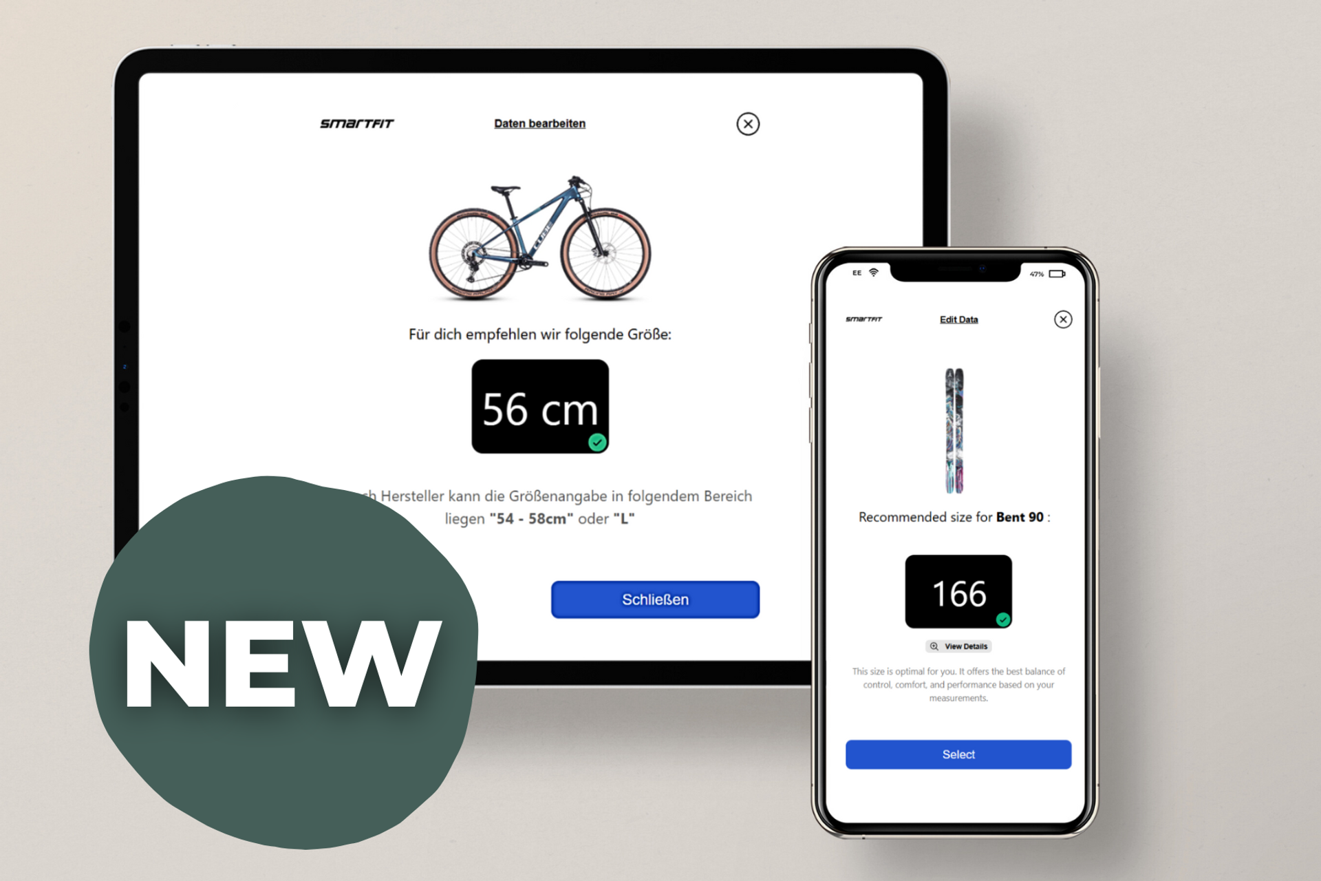
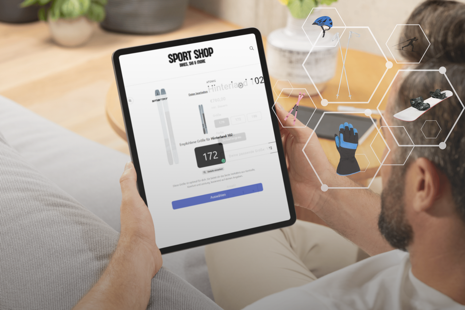
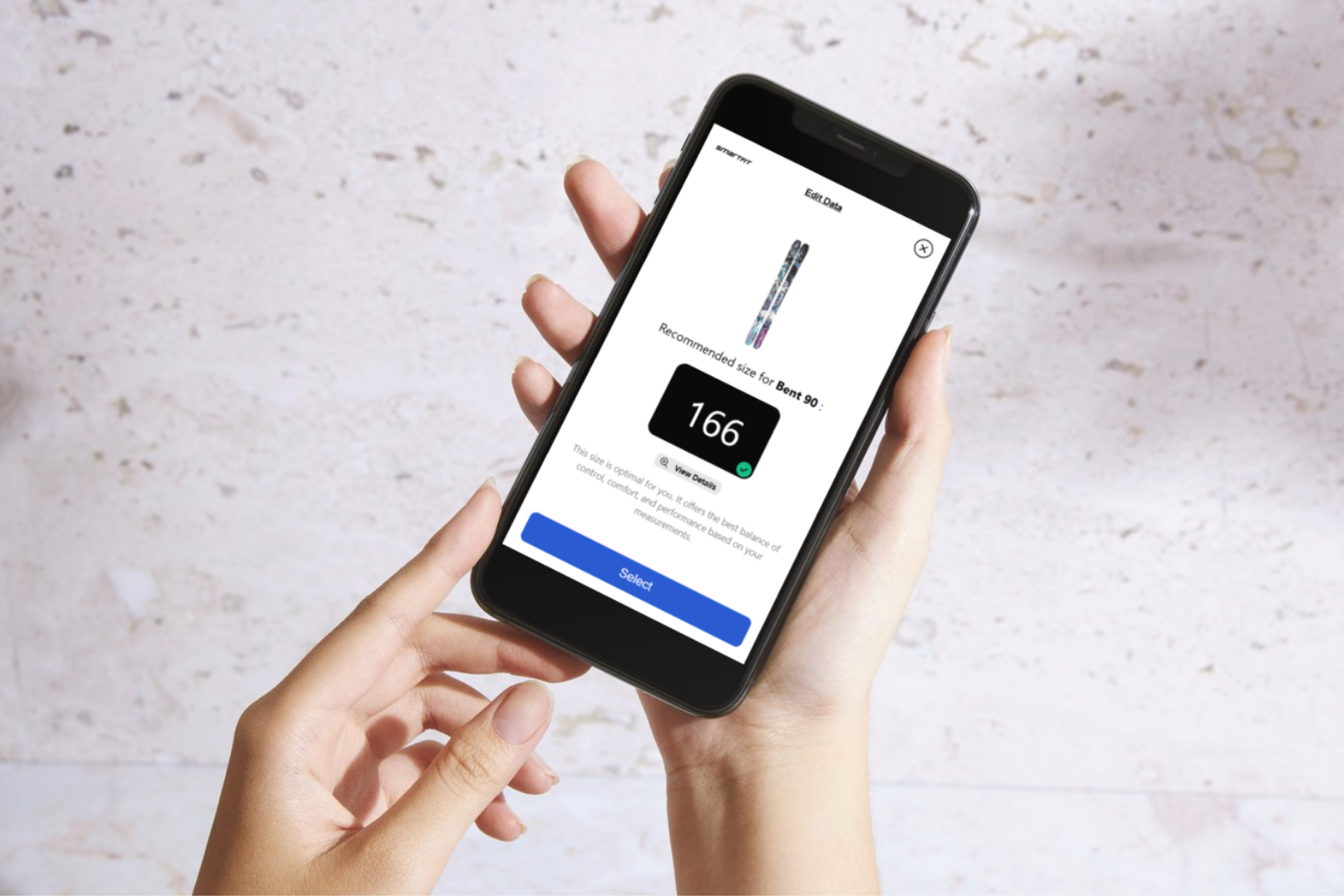
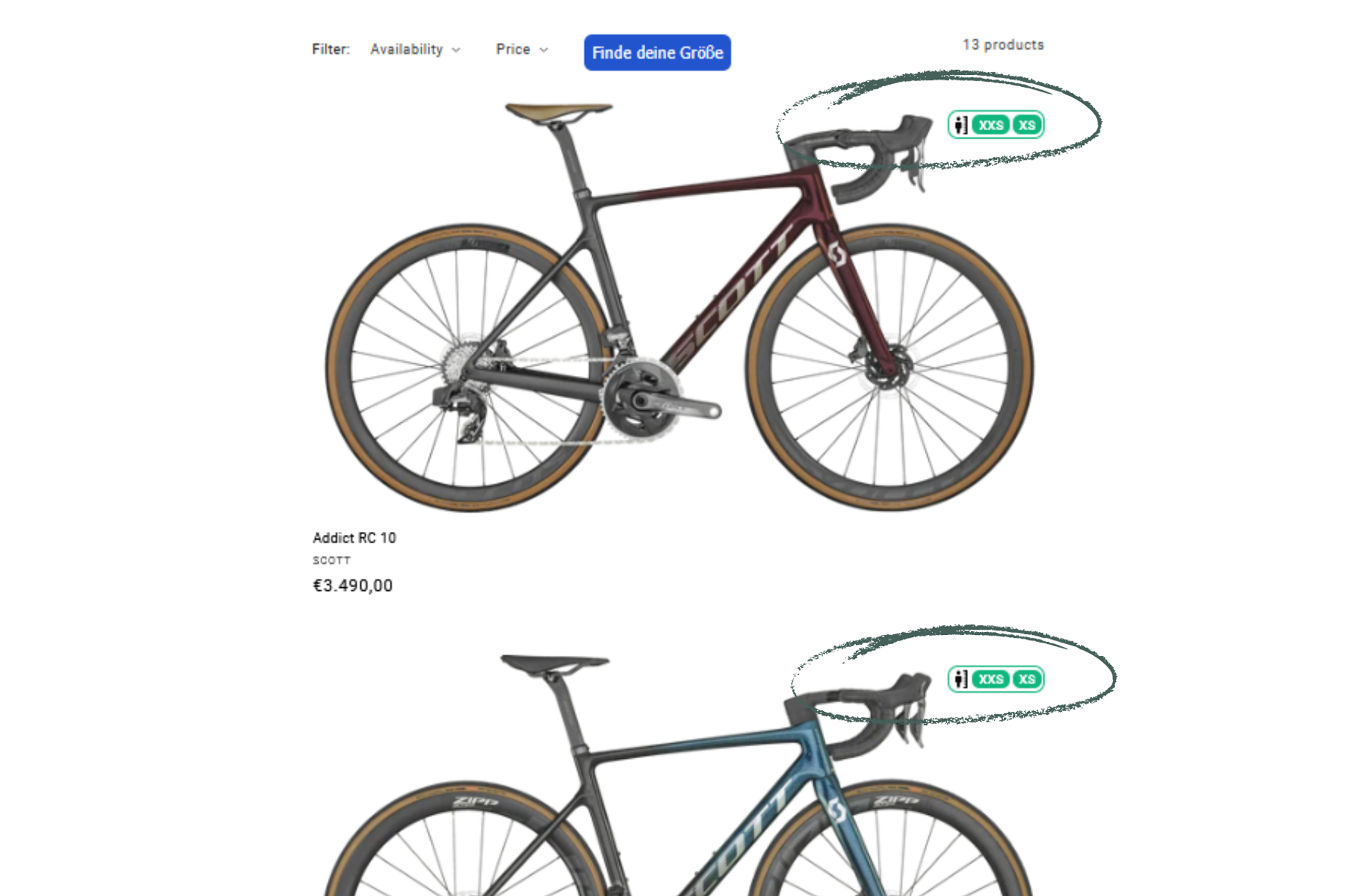
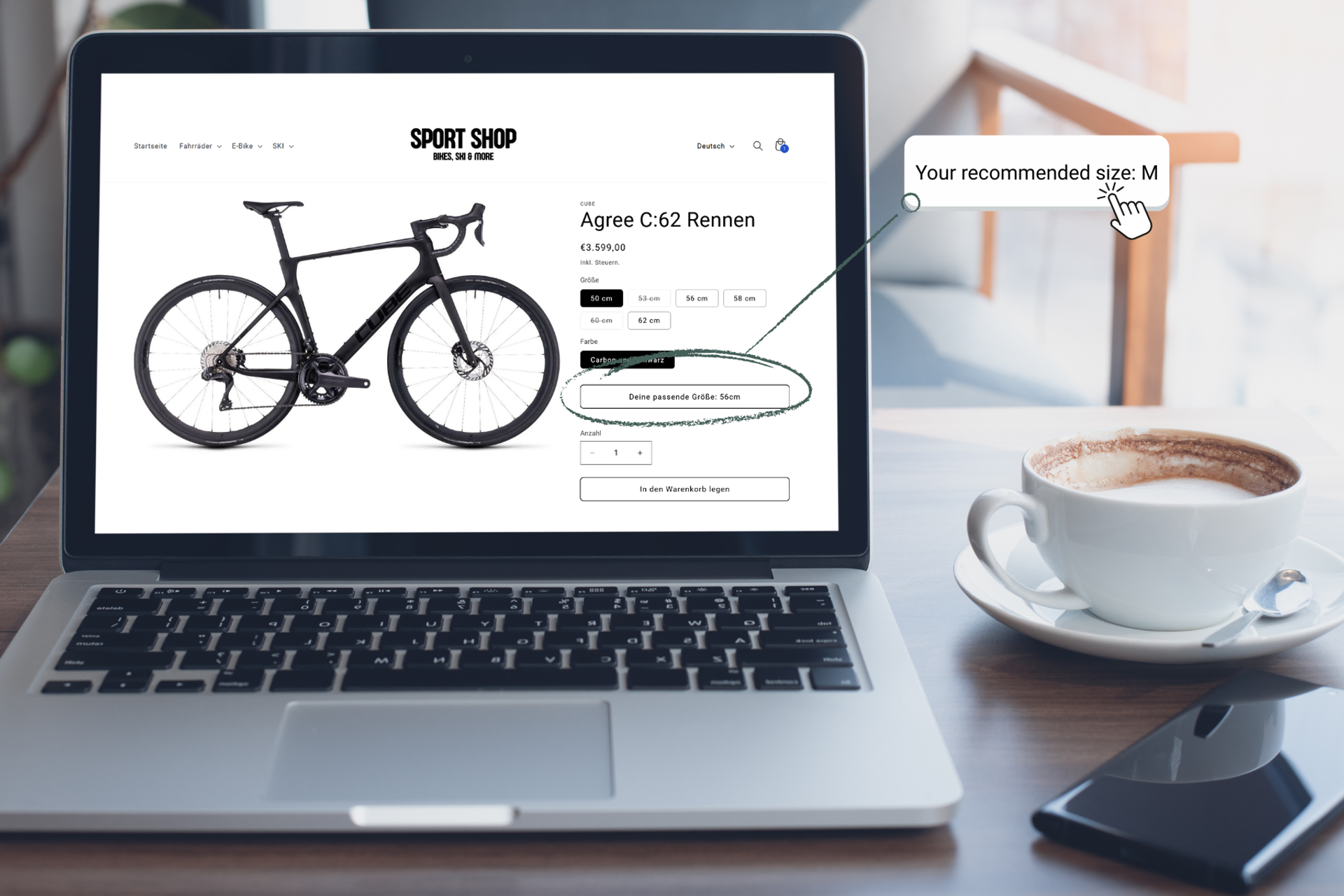
The Smart Sizing Button – Sizing with one click
One of the biggest innovations is the so-called Smart Sizing Button. With the new version, the personal sizing, once determined, can be used throughout the entire store – for an even more intuitive and efficient shopping experience.
- Personalized size display on category pages: Users can see which size(s) fit them best for each product right from the product overview. This provides a quick overview of suitable options – without having to click on the product page.
- Recommendation directly in the button: The recommended size is displayed directly in the button on the product pages. Users don't have to enter any information again – saving time and ensuring a seamless shopping experience.
The result: Customers immediately see which products are suitable for their size – personalized, transparent, and without additional effort. This provides orientation and increases purchase intent, especially in large stores with different categories (e.g., skiing, biking, running).
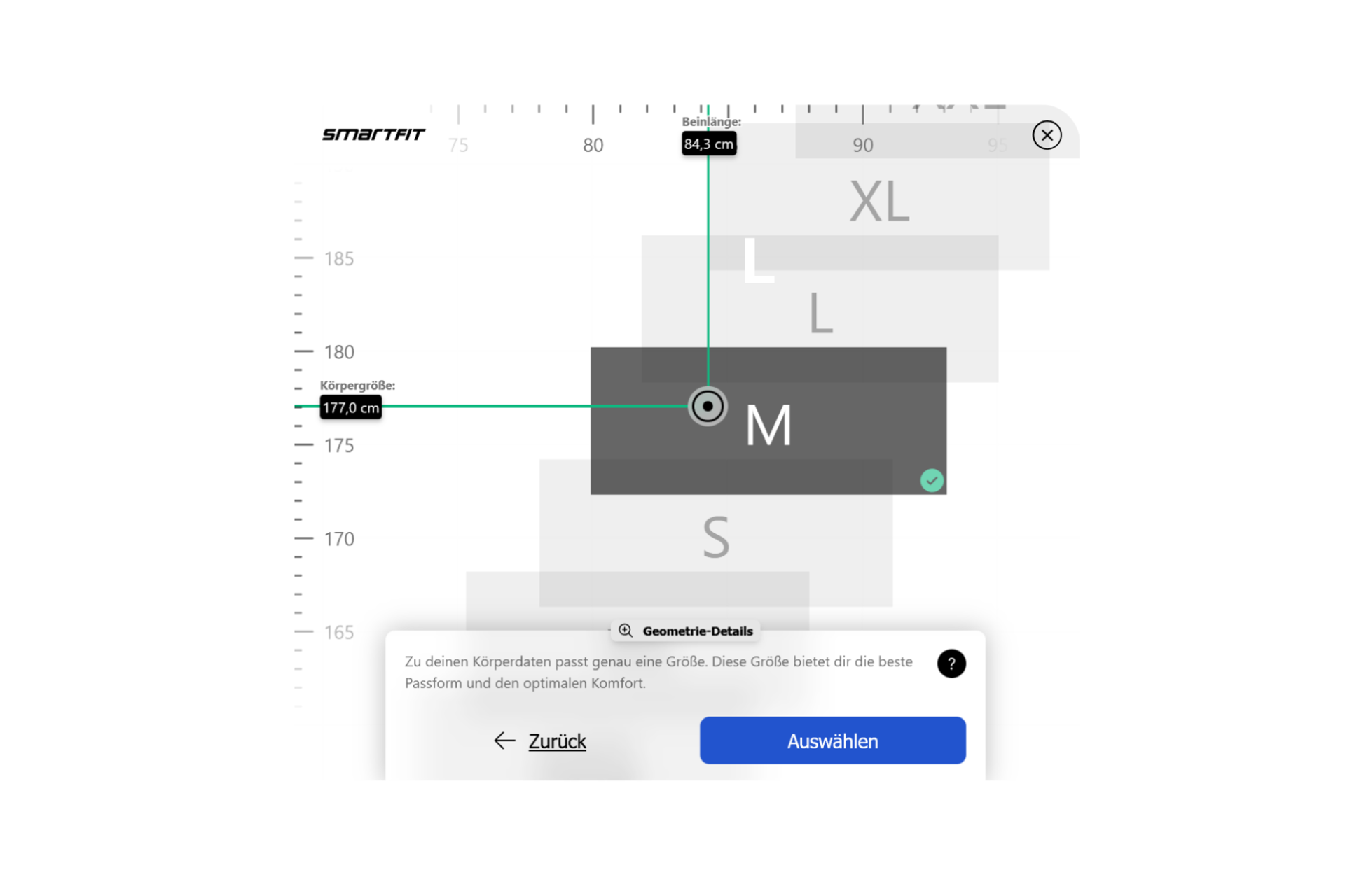
Flexible results screen – for beginners and bike nerds
Version 2 only offered one view for the results. This wasn't enough for some user groups – especially "bike nerds" who wanted to know exactly why a particular frame size was being recommended.
With version 3, we're solving this problem with a two-level results screen:
- Level 1: Quickly and clearly displays the recommended size – ideal for beginners
- Level 2: For experts, there's a detailed view with all available sizes, graphics, and explanations for the selection. This allows for informed decisions and builds trust – especially for expensive products like road bikes
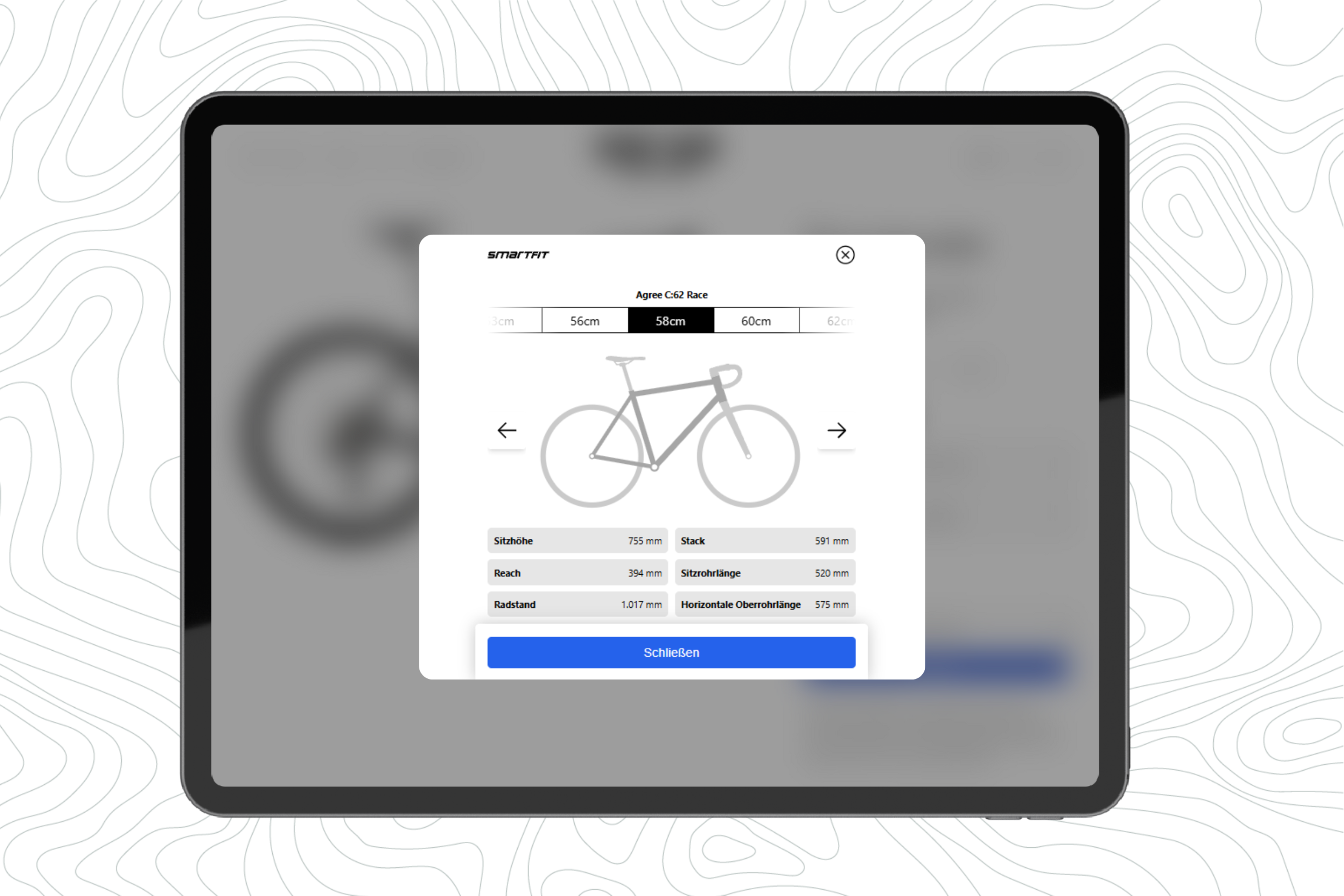
New Geometry Display: Truly Understand Frame Sizes – Instead of Reading Tables
With the new geometry display, we make bicycle geometry significantly more tangible – right where it makes sense: directly on the bike. Instead of dry columns of numbers, the geometry is rendered as a dynamic graphic that adapts to the model and frame size in real time. This creates a real sense of what "bigger" or "smaller" actually means in terms of frame size. The most important measurements are plotted directly on the graphic and each is briefly explained: What do reach, stack, and other measurements mean – and how do they affect riding position, handling, or comfort? A particularly useful feature: Once sizing has been performed, we also display the recommended saddle height based on the inseam and even visualize the saddle position. This provides that famous "aha" moment – and eliminates uncertainty when choosing a frame size, especially before buying.
Uniform size communication – less confusion in the shop
A problem we were aware of, albeit relatively rare, was the inconsistency between the sizes used by the manufacturer (e.g., S/M/L) and the sizes displayed in the respective store (e.g., 52/54/56). This naturally led to confusion among end customers – for example, when the online sizing recommended size "M," but the store only displayed numerical sizes.
With version 3, this was solved with clever translation logic in the background:
- The widget speaks the "language of the shop," internally translating sizes to the shop's specifications, thus ensuring consistency
- Complex but effective: The customer always sees the correct size for them in the respective shop's logic – a small detail with a big impact
Reduced, user-centered design
V3 has been significantly simplified – and intentionally so. User feedback and user testing made it clear: less is more. Therefore:
- One question per screen: Better comprehensibility, especially on mobile devices
- Reduced UI: Based on best practices from other sizing tools worldwide, with a clear focus on mobile usability
- Discussions with shop designers? Significantly less necessary – the new design is clear and adaptable
Feedback from practice – what do the first customers say?
The new Category Sizing and Smart Sizing button have been received very positively. Initial partners particularly praised:
- The seamless integration across all product categories
- The improved user experience
- The new features for experts
There were a few questions regarding the design – it was recognized that clearer communication from the beginning would have been beneficial. This is now being addressed, including with presentations that better explain the background and design decisions.